

Mobilegeddon. Googpocalypse. Despite some of the more dire warnings out there, it’s really not the end of the world as we know it, I promise.
But just in case you haven’t heard the news, here it is in a nutshell: Google rolled out a pretty significant change to its search algorithm that could have a substantial impact on your website’s traffic. Announced back in February 2015, the new algorithm boosts the rankings of those webpages Google has deemed are “mobile-friendly” in mobile search results worldwide. If your site doesn’t measure up, you could see your webpages buried in Google’s search results in favor of pages meeting these new mobile-friendly requirements. In turn, this could cause your web traffic volumes – and maybe your ad revenues – to take a nosedive.
Sounds pretty grim, right? Well, not to worry (much).
Yes, this is a big change from the Google search algorithm we all know (but don’t always love). However, here’s why you shouldn’t panic: meeting Google’s new mobile-friendly requirements isn’t as challenging as you’d suspect. And even then, the scope of this update is limited only to those Google searches performed on mobile devices – desktops and tablets won’t be affected.
Furthermore, this is a page-level rather than site-level change, meaning that even if you have one, two, or 10 pages that don’t meet Google’s mobile-friendly threshold, page rankings for your entire website won’t necessarily tank. And if all of that isn’t enough to soothe your (or your webmaster’s) jangled nerves, consider this quote from Google’s FAQ:
“The intent of the search query is still a very strong signal – so even if a page with high quality content is not mobile-friendly, it could still rank high if it has great content for the query.”
There you have it. It’s definitely a significant enough change that you’ll want to address it as quickly as possible, but not so pressing that your web team needs to pull an all-nighter to fix it (oh and by the way, it’s going to take anywhere from a few days to a few weeks for the update to be fully implemented).
Why the big change? And why now? Believe it or not, Google is trying to help you.
According to comScore, some 60 percent of all web traffic comes from mobile devices. Google has also said approximately 50 percent of searches are now performed using a mobile device of some sort. In today’s increasingly mobile-driven world, the 900 lb. search gorilla in the room wants to make sure that websites will look good, load quickly, and perform properly on non-desktop devices, especially given the sheer volume and value of ad revenues these days. This algorithm change is part of its effort to make sure that they do.
So, what can you do to ensure that your website doesn’t slide to the bottom of Google’s search results? Here are a few recommendations to get you started:
Google offers friendly advice for making your site mobile-friendly
- Take advantage of Google’s “Mobile-Friendly Test” to see whether your website meets the new requirements. You may find that your site has already been deemed mobile-friendly.
- If your site doesn’t pass, make sure you pay close attention to why it didn’t – Google gives you its reasoning right on the test page as soon as its analysis is complete. There’s even a “Make this page mobile-friendly” wizard that will give you helpful tips for optimizing your site.
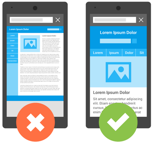
- Evaluate your site closely…and be brutally honest about its quality. Are you using responsive design? Do you have a robots.txt file that’s preventing Google’s web crawlers from crawling and indexing your site? How fast do your pages load? Do your pages look attractive on a mobile device (for example, do all of the images load properly)? All of these things will play into whether your site meets the mobile-friendly threshold.
- If you find that you have some work to do, meet with your web team to hash out a plan to migrate to a more mobile-friendly site. Remember, you’ll have some time before Google’s algorithm fully takes effect, so plan a careful, effective strategy that allows a smooth transition. Be sure that you and your team avail yourselves of Google’s wealth of resources, like its Webmaster’s Mobile Guide.
- Once you’ve got your mobile-friendly site completed (and it has passed Google’s test), make sure you submit your sitemap via Google Webmaster Tools.
As you can see, Mobilegeddon, the Googpocalypse, or whatever you want to call it, is truly not end of the world as we know it, it’s merely a rethinking of it. Yes, you’ll need to be proactive but with a little time, effort, and good planning, you site will once again be flying high in Google’s search results. Good luck!