While always an important factor, the visual component of content messaging has become even more critical over the last few years. Whether we are talking about Twitter posts, Facebook ads, email marketing or direct mail, consumers are overwhelmed with marketing messages. In order to filter and prioritize where they devote their attention, people are using visual cues – what they see – rather than what they read.
Here are five proven techniques on how to get your audience to stop, read and engage with your content:
Get a move on with video and animation. With the popularity of live streaming and Instagram Stories, video is a must for any brand. In Wyzowl’s “The State of Video Marketing 2018”, 97% of marketers said video has helped increase user understanding of their offerings and 76% said it has helped increase sales.
 The great part is these do not need to be massive undertakings. Film an upcoming webinar speaker during a Skype conversation and share what they’ll be talking about. Easily convert your company PowerPoint overview into an animated video.
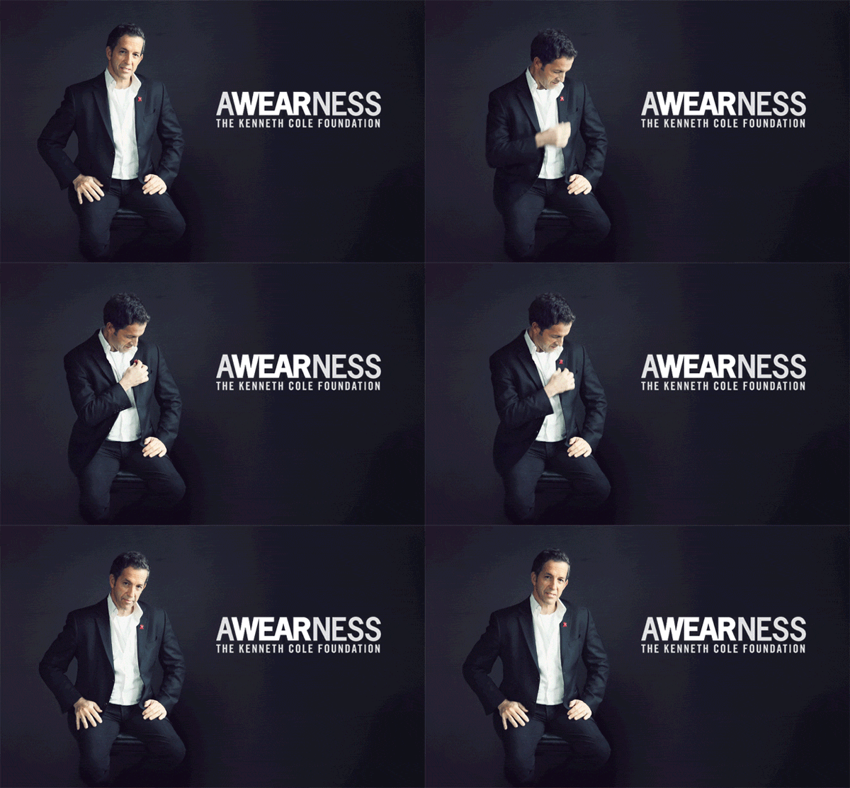
Another wonderful option to help organizations stand out are cinemagraphs – a visual where 1-2 elements are moving while the rest of the image remains still. This Kenneth Cole Foundation cinemagraph example is a fun, replicable idea for announcing conference speakers or upcoming podcast guests via social media.
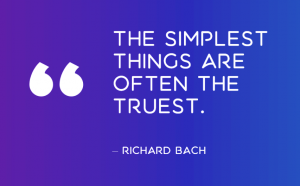
Use a limited vibrant color palette for “pop.” An appealing and striking visual way to make an announcement or quote standout is through the use of bold, vibrant color.  Bright and neon colors convey excitement, freshness, something new. Contrasting colors also benefit those with visual difficulties like color blindness. But do not go overboard; keep to a two or three color combination.
Keep backgrounds simple. Keeping backgrounds minimal also makes your copy stand out more. We are scrolling through hundreds of visuals a day – a strong color stands out. Duotone and gradient backgrounds are popular and add a touch of sophistication to just a one-note background.
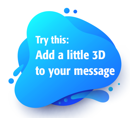
 3D your message. People tend to stop on 3D content, curious about how the text or image was created. This design treatment lends itself well to futuristic themes or to convey the feeling of motion (flying, floating, words coming at you, etc.) in your message. Thanks to the availability of easy-to-use tools, this popular 3D treatment can deliver big impact to your message.
Get original with photography. There are two paradoxical trends right now – futuristic, space-age visuals versus authentic real-life images of people. Including people in designs has always been a strong draw, so lean toward sharing photos of authentic usage of your products or services. Candid photos of staff and products “in use” can strengthen feelings of trust and brand transparency.
Still feel compelled to use a lot of stock photos for your visuals? You can make them feel different with subtle tweaks like color, rotation, cropping and more.

We recommend the following two guidelines when considering what to incorporate into your designs for 2019:
- Research competitors and similar brands on social media. Imagine if your message showed up in the context of a twitter stream with these other messages, what would make them stand out? Is the group oversaturated with blue? Stand out by using red or orange backgrounding. Are many using futuristic abstract designs? Perhaps your design should focus on people and authentic real-life moments.
- What is consistent with your brand’s persona and other marketing materials? While a serious brand may be able to pull off a playful and bolder visual look, you should do so only after some careful consideration. Think of it like switching radio station formats. If you’ve been playing smooth jazz, suddenly switching to heavy metal can be more jarring than refreshing.
Credit: The Kenneth Cole Foundation GIF from joyenjoys.com

